Hi Tea
Branding & Package Design
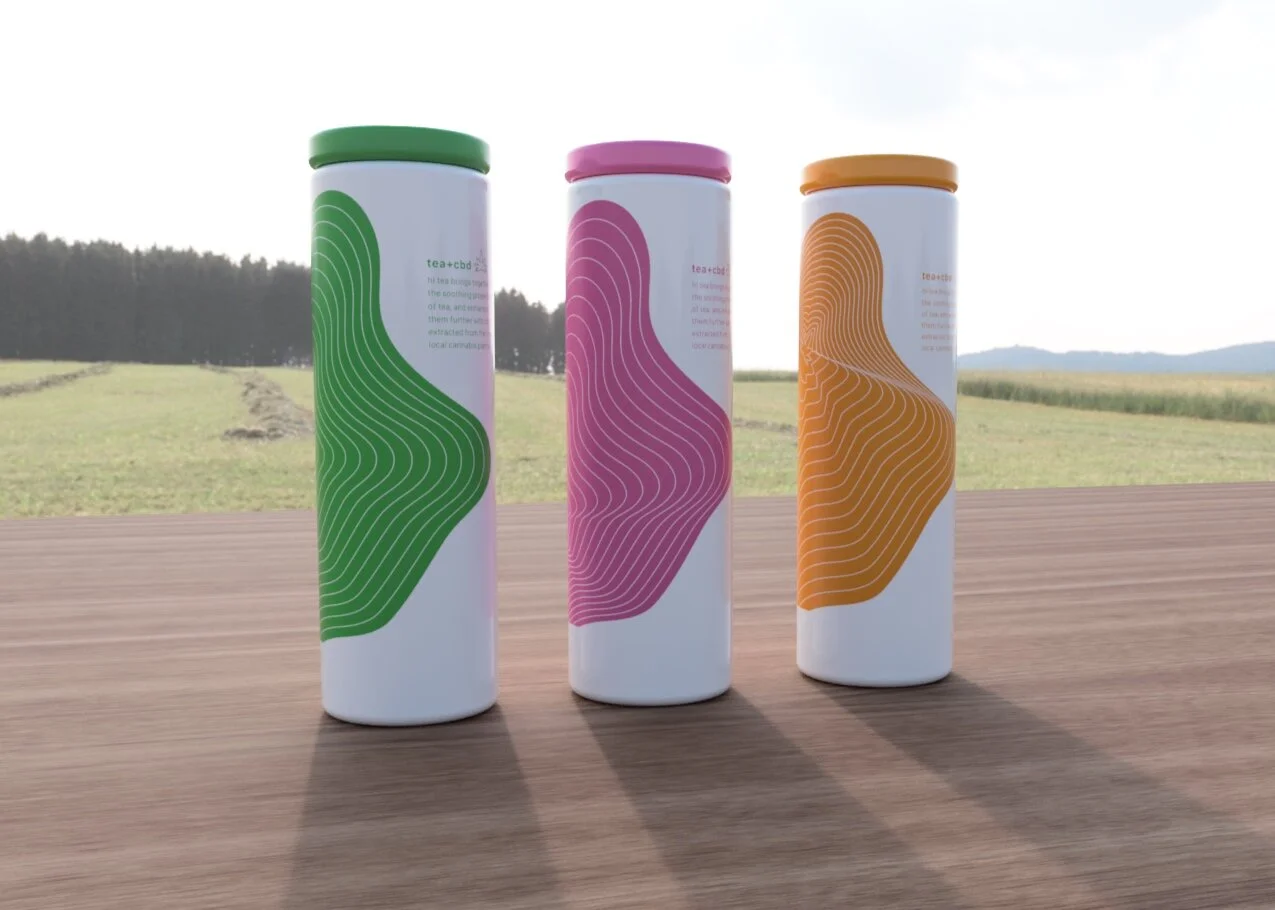
Hi Tea brings together the pleasing properties of tea and fresh fruits and enhances them with CBD. The packaging is an embodiment of the brand’s aim for simplicity, while also contrasting with the complex pattern featured prominently on the front of the bottles. Hi Tea is a unique brand that combines the health benefits of tea and fresh fruits with the therapeutic properties of CBD.


Branding
The brand identity of Hi Tea is built around simplicity, purity, and wellness, with a minimalistic logo that features a clean and simple typeface, along with a playful didot that evokes the natural, fresh, and uplifting qualities of CBD. This approach adds a sense of fun and excitement to the brand, setting it apart in a crowded marketplace. By using soft colors and natural forms, the design further emphasizes the natural and organic aspect of the product, while the minimalistic style ensures that the brand is easily recognizable and memorable.
Package
The packaging design for Hi Tea's CBD-infused fruit teas is both elegant and functional, embodying the brand's ethos of simplicity and purity. The tall cylindrical shape of the bottle is clean and understated, with no excess embellishments or distractions. Instead, the focus is on the intricate ripple pattern that covers the bottle's surface, evoking the calming ripples of water and reflecting the natural ingredients of the product. To complement the bottle's minimalist aesthetic, the packaging features a flat aluminum cap that matches the color of the hemp plastic bottle, creating a pleasing visual contrast and providing a secure seal for the product. Together, these design choices help create a memorable and recognizable packaging that aligns with the brand's values of quality and wellness.