
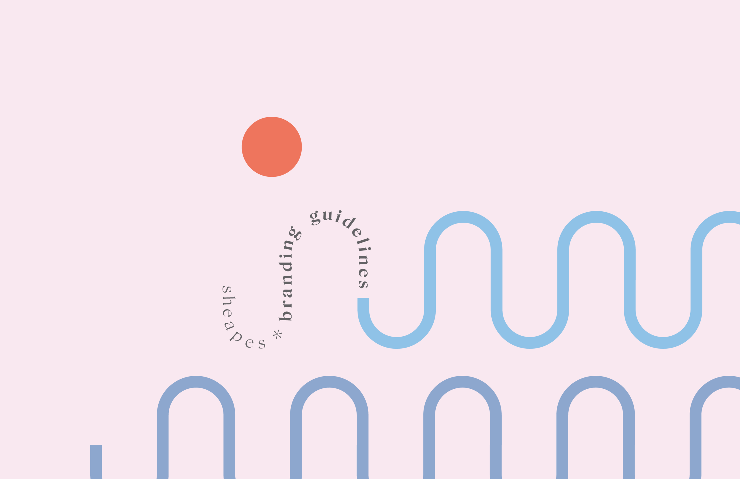
Sheapes
Branding & LOGO Design (FREELANCE)
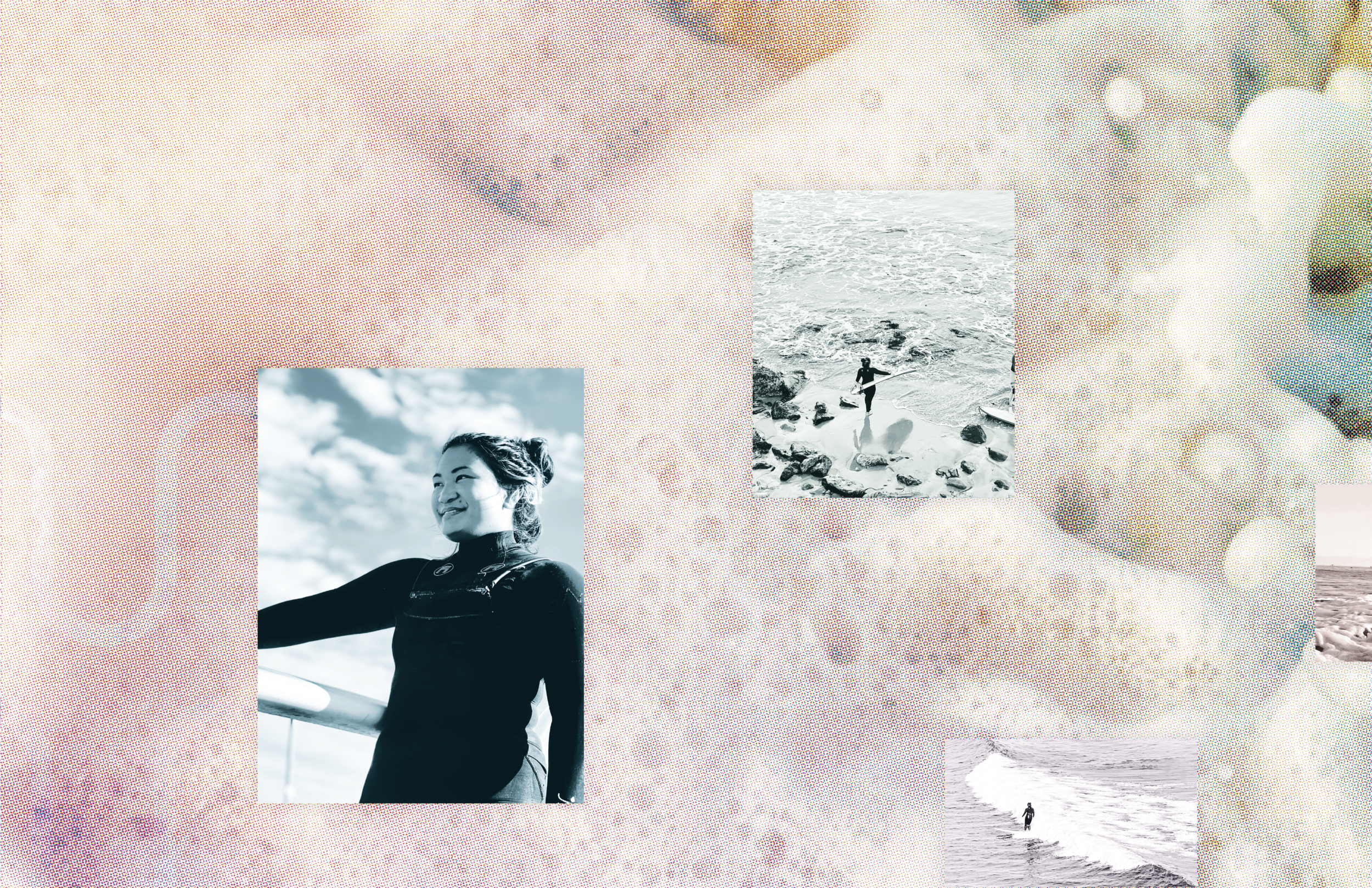
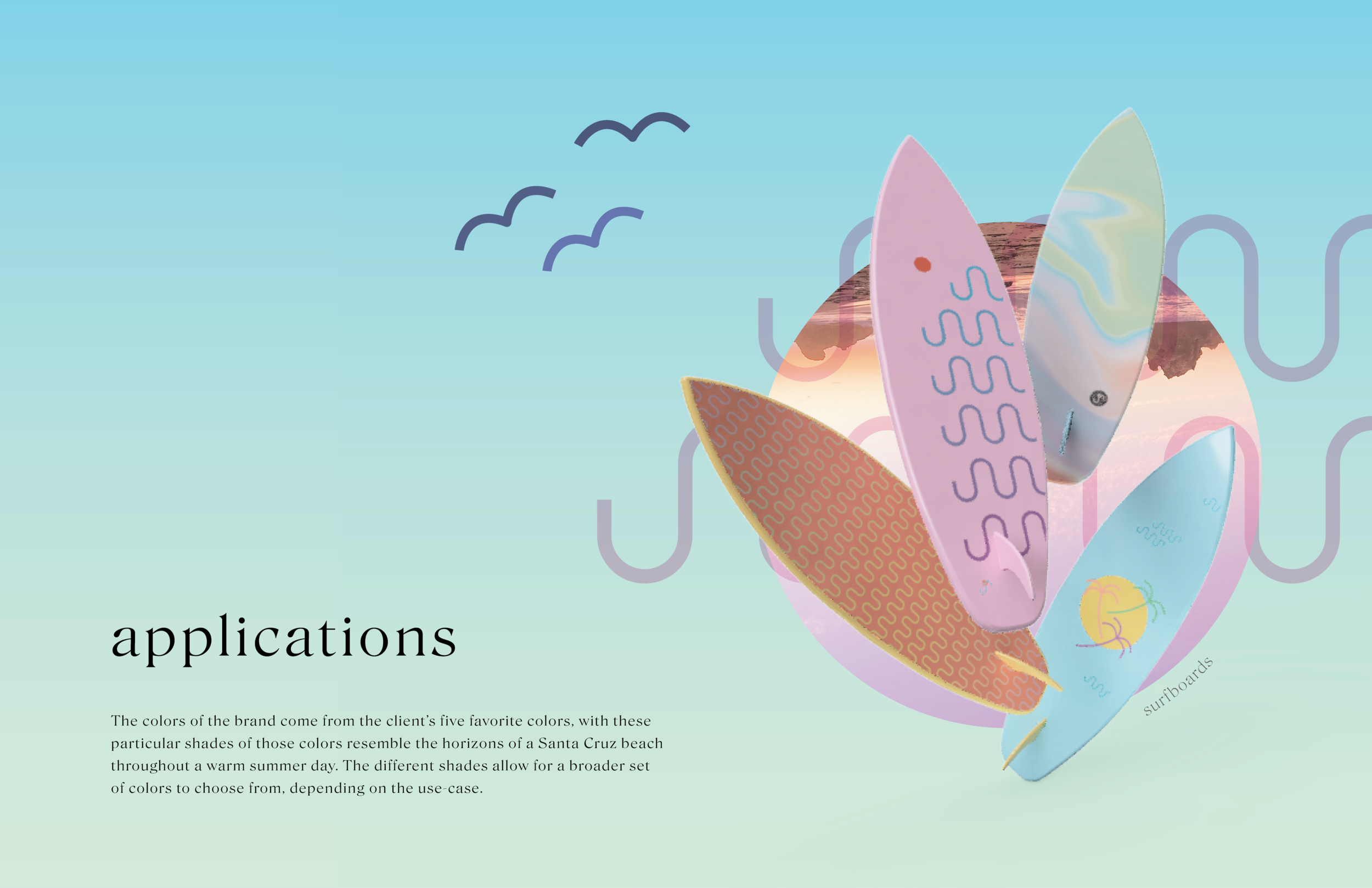
California's beach-side lifestyle is an iconic part of American culture, and Sheapes embodies this way of life perfectly. The brand, which is designed specifically for surfers and beach-goers, captures the essence of what it means to be a part of this vibrant community. With a focus on functionality and style, Sheapes' surfboards are the perfect tool for riding the waves on a warm summer day.
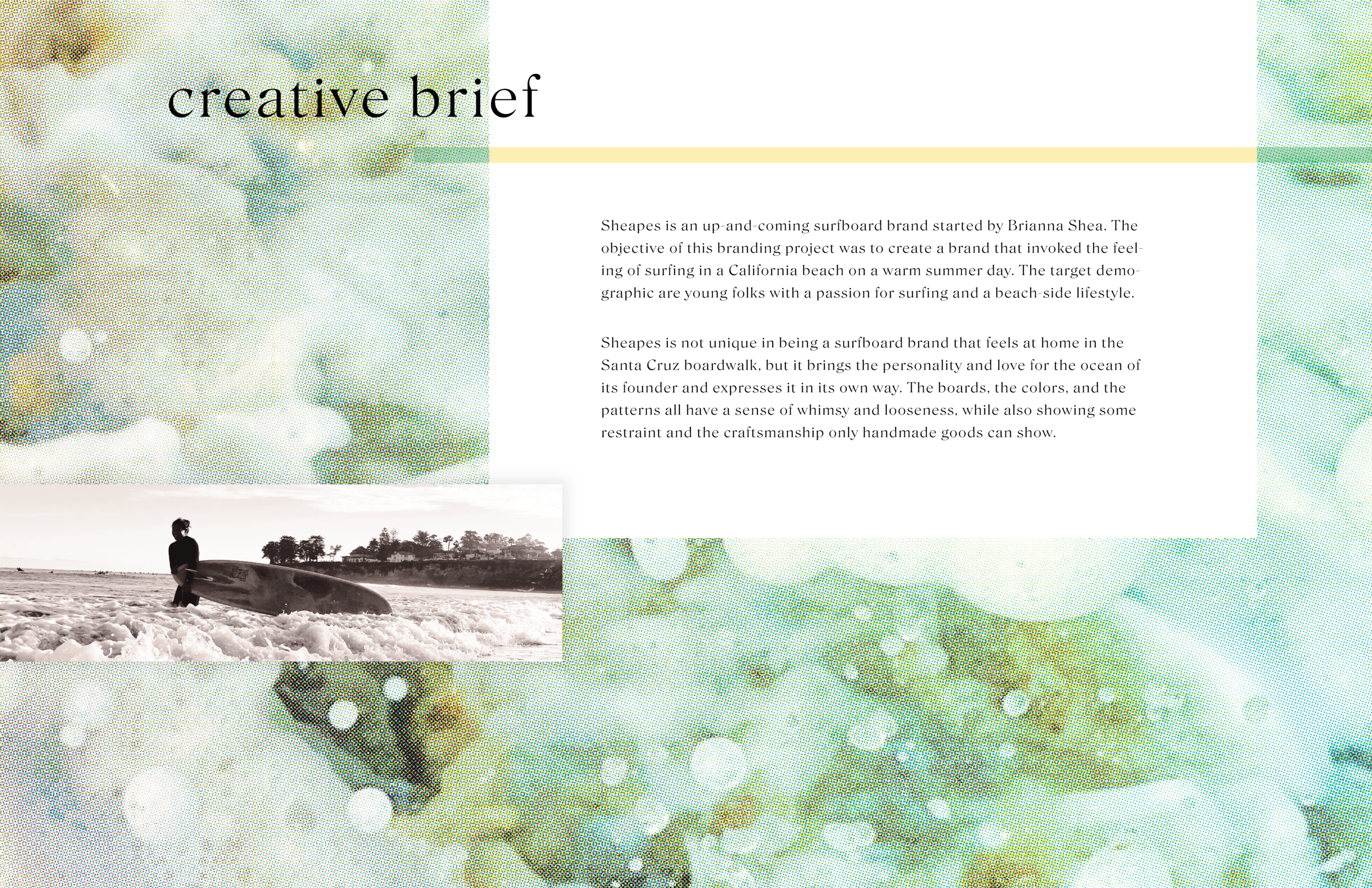

DOCUMENTATION
The Sheapes process book provides a glance into how the graphic elements of the logo may be used together with images and type, while also illustrating the thinking and inspiration behind every design decision made.
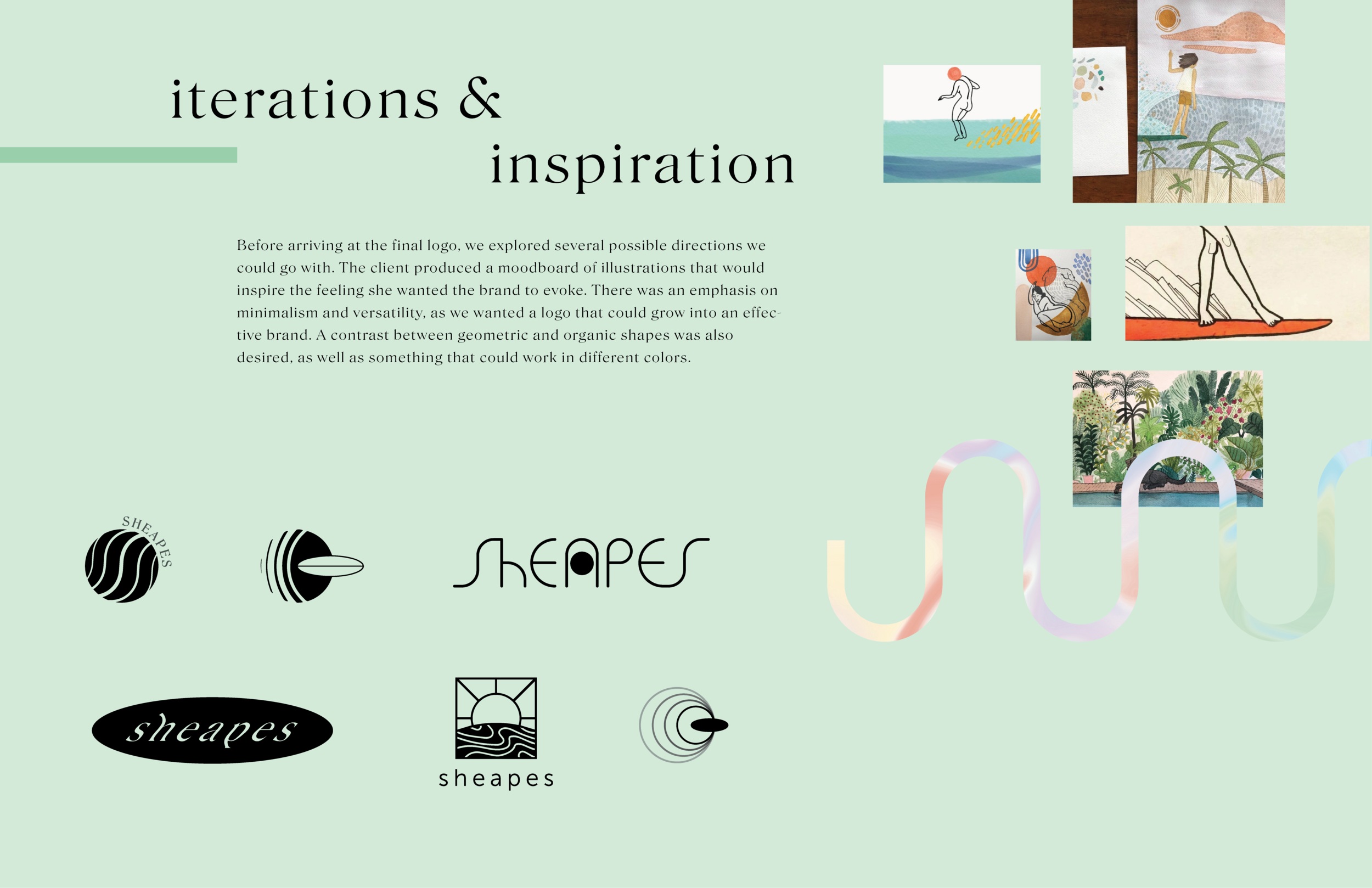
Ideation
Before arriving at the final logo, we explored several possible directions the brand could go in. The client produced a moodboard of illustrations that inspired the feeling she wanted the brand to evoke. There was an emphasis on minimalism and versatility, as we wanted a logo that could grow into an effective brand. A contrast between geometric and organic shapes was also desired, as well as something that could work in different colors.
OUTCOME
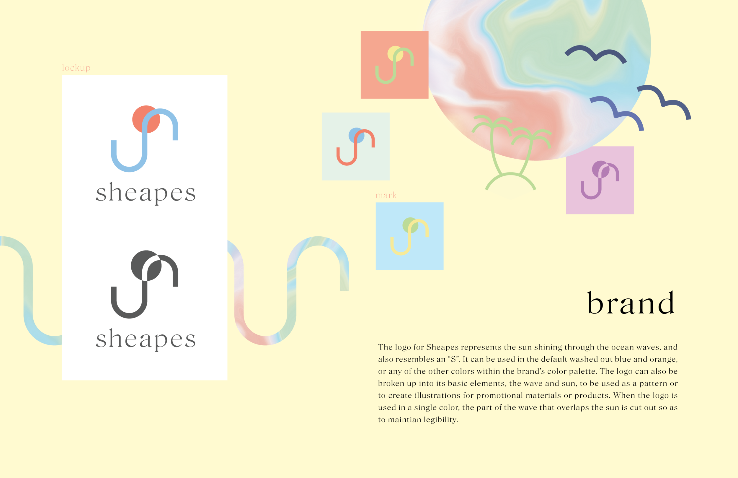
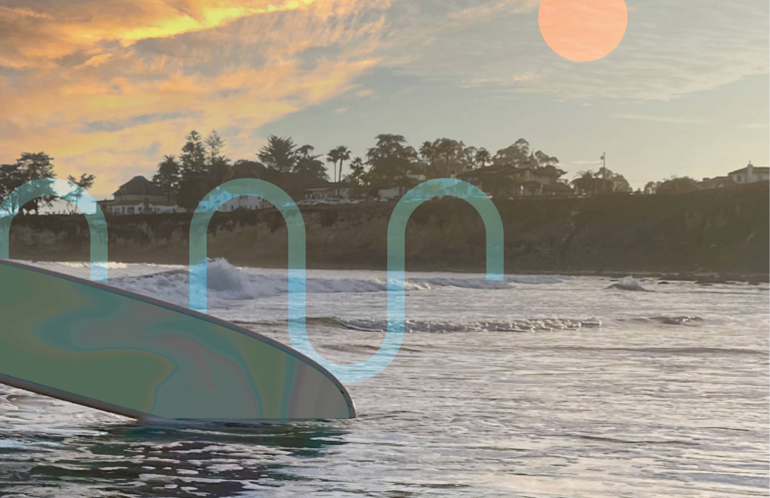
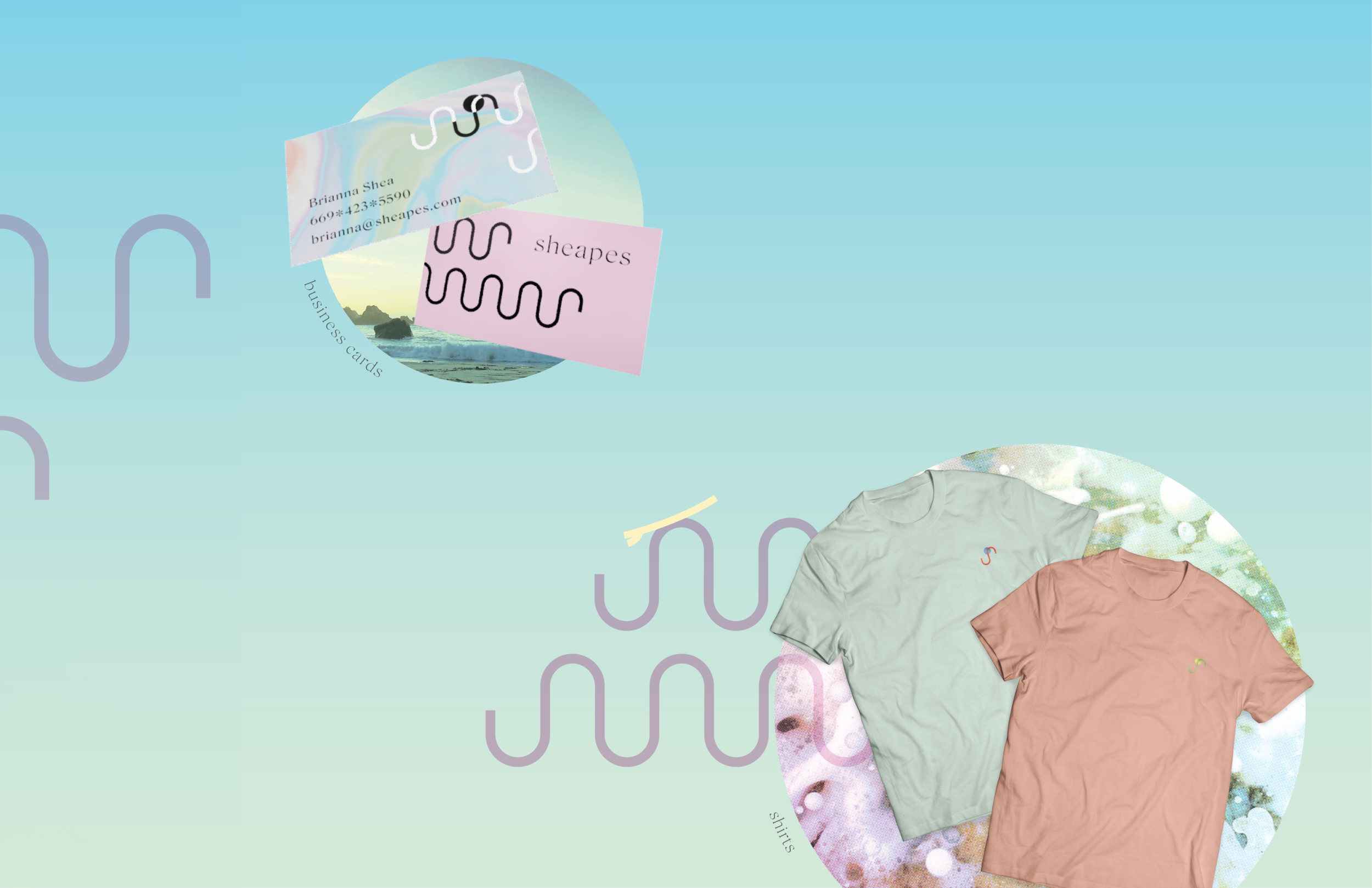
The logo for Sheapes represents the sun shining through the ocean waves, and also resembles an “S”. It can be used in the default washed out blue and orange, or any of the other colors within the brand’s color palette. The logo can also be broken up into its basic elements, the wave and sun, to be used as a pattern or to create illustrations for promotional materials or products. When the logo is used in a single color, the part of the wave that overlaps the sun is cut out so as to maintian legibility.
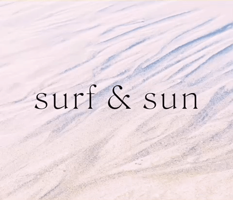
TYPOGRAPHY
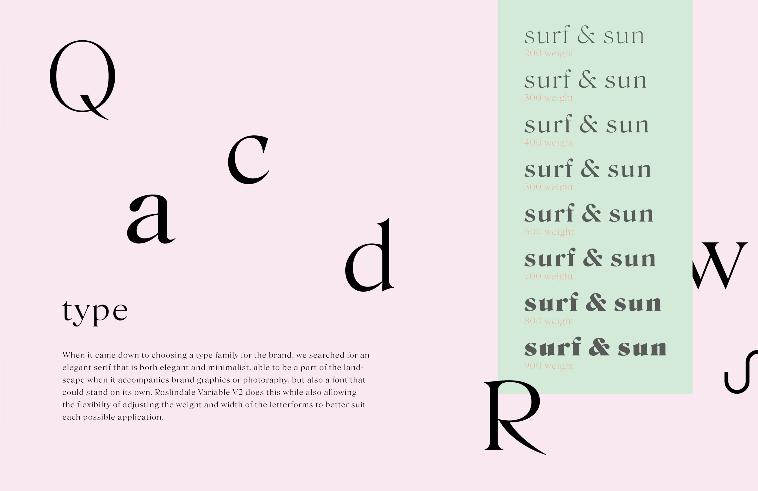
When it came down to choosing a type family for the brand, we searched for an elegant serif that is both elegant and minimalist, able to be a part of the landscape when it accompanies brand graphics or photography, but also a font that could stand on its own. Roslindale Variable V2 does this while also allowing for the adjusting of the weight and width of the letterforms to better suit each application.
